Enduring Web Designs
Focus on quality content
Focus on content design in priority over website chrome and let your content dominate what the viewer sees. Keep the visitor occupied on what they came for by making the design unnoticeable. Use great photography and typography.
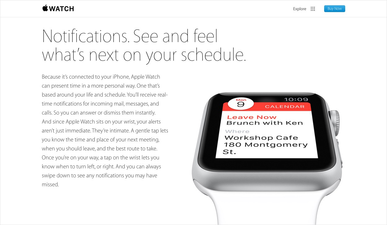
 Apple can be a cliche example, but Apple has always focused on rich content. There really isn’t any design chrome beyond typography and the menu.
Keep your layout and ornament simple.
If you can do without an element or decoration, take it out.
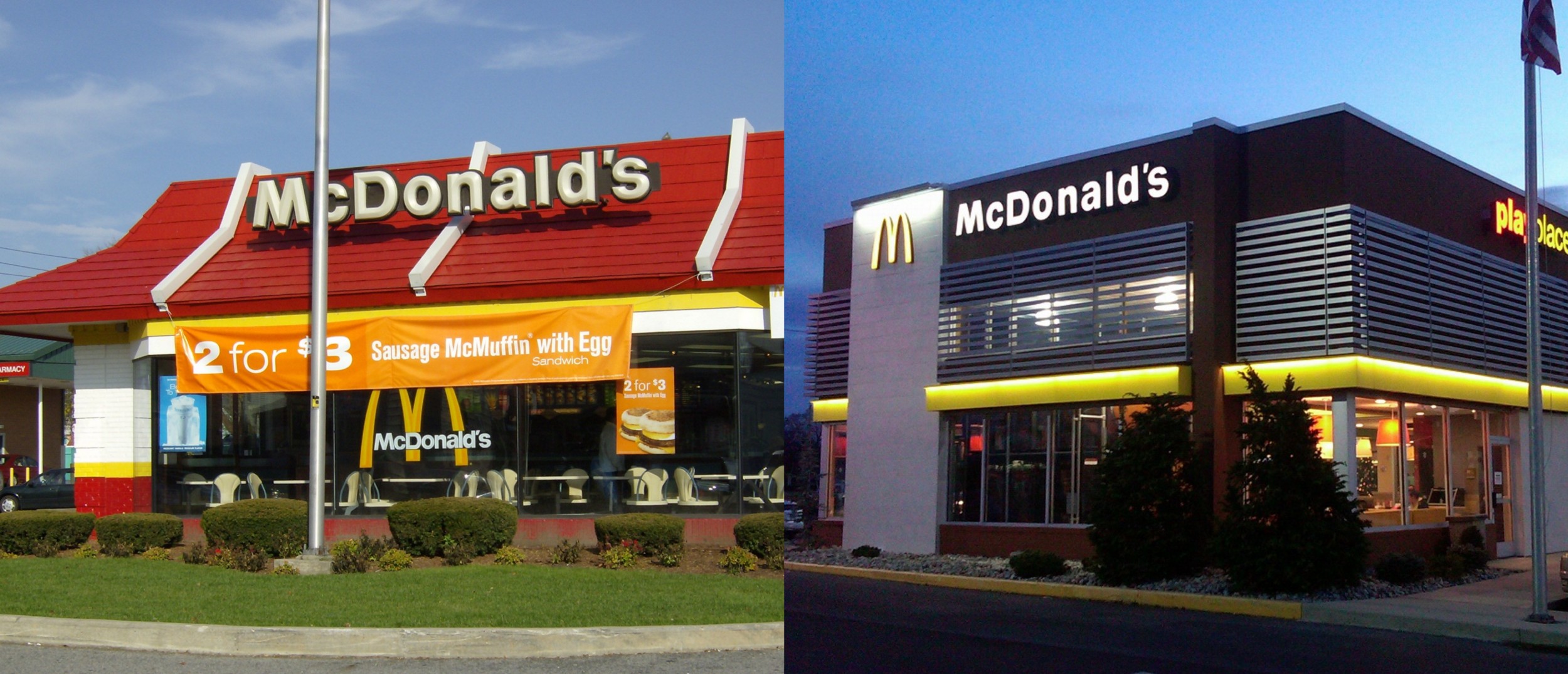
 Traditional McDonald’s buildings are over-branded. The new designs focus on classic architecture and are very minimal in branding.
Avoid over-branding
Oversized logos, skeuomorphic decorations, over-designed buttons, colorful text, stylized illustrations and icons, etc. The branding itself has an expiration date.
Be cautious using popular design trends.
This can be really hard, especially when you want to impress a client with an “up-to-date” redesign. Trends will immediately set an expiration date to your design. Trends come and go every year, so stick to the basic elements of design that are hard to argue with like line, color, shape, and space.
“Good design is obvious. Great design is transparent.” -Joe Sparano
Learn from the past & plan for the future
- Take the time to thoroughly plan and consult SEO.
- Do not ignore responsive design and device native considerations.
- Build your website on a trusted front-end framework. This should help cut down on common usability and browser bugs. Fewer bugs and usability issues can mean a longer life span.
- Make updates modular. To avoid a total redesign, update the most needed sections piece by piece. This is great for keeping frequent users comfortable to changes. They may never even notice!
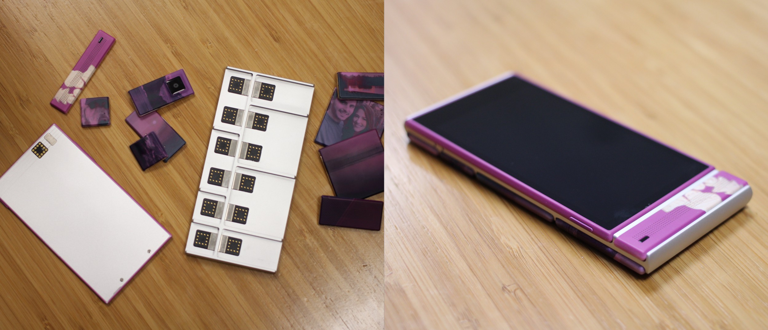
 Google’s Project Ara uses modular hardware to update parts of the phone individually. There is no need to throw away the whole phone if a piece breaks or becomes obsolete.
- User-test your website to make sure it will work for your personas. Putting in this extra step can ensure usability and longer usage.
- Make sure your CSS is clean and understandable to others. Include comments where necessary.
- Design your CMS content to be unbreakable. Keep text dynamic above static imagery and prepare for absurdly long titles, names, or emails, etc. Design your CMS backend with a planned user experience. Prepare documentation and train your client to use the CMS backend. Don’t just drop them into the labyrinth of a Wordpress tagging nightmare.
- Call your clients frequently to see if they need help or maintenance. They may get new employees who aren’t used to managing things.
Here are a few brands striving to portray a classic web presence,
- Google search
- Youtube
- Yahoo
- Amazon
- Netflix
Conclusion 📓
Enduring web design is not characterized by the most beautiful or engaging in esthetics, but by minimal classic design elements. This discussion is focused on the goal of building an affordable and lasting web presence. Technology is always evolving, but there are systematic ways to make your design stand the test of time.


 Up next
Digestible Web Compositions


