Digestible Web Compositions

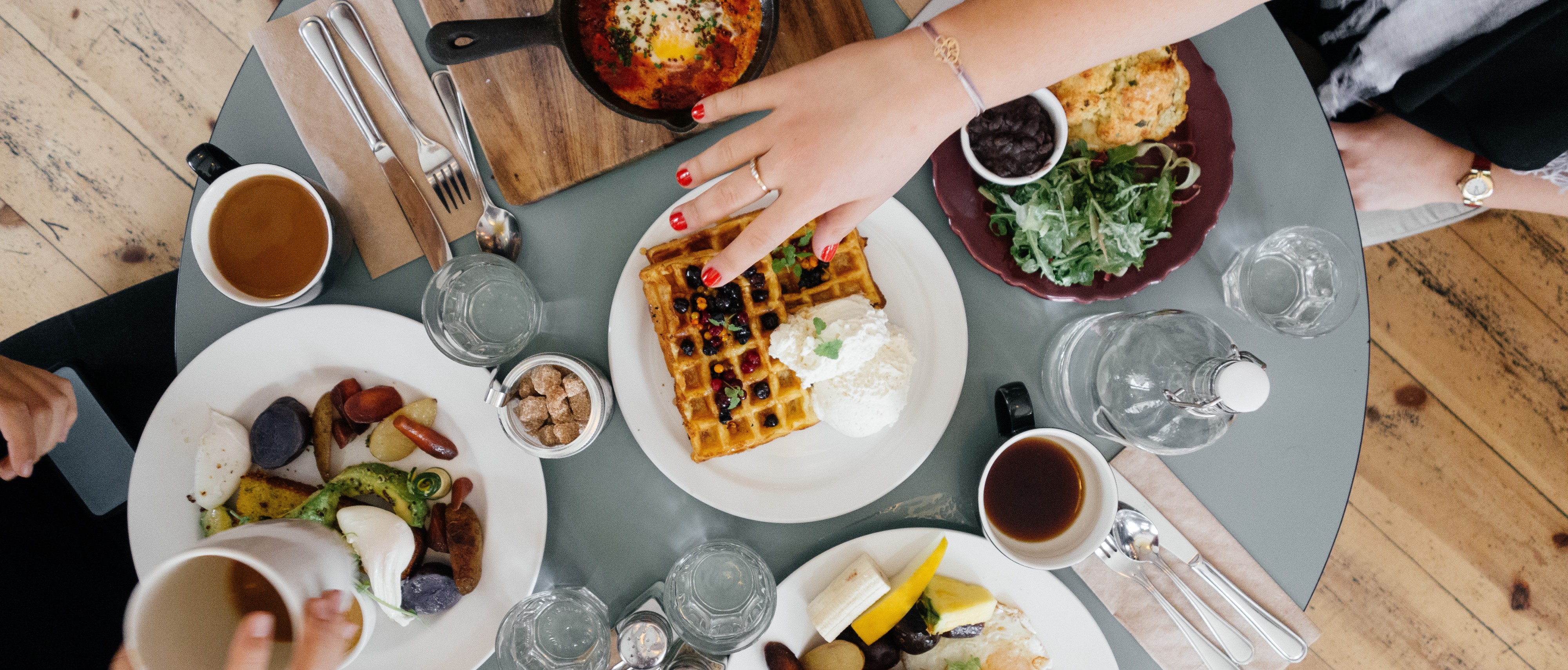
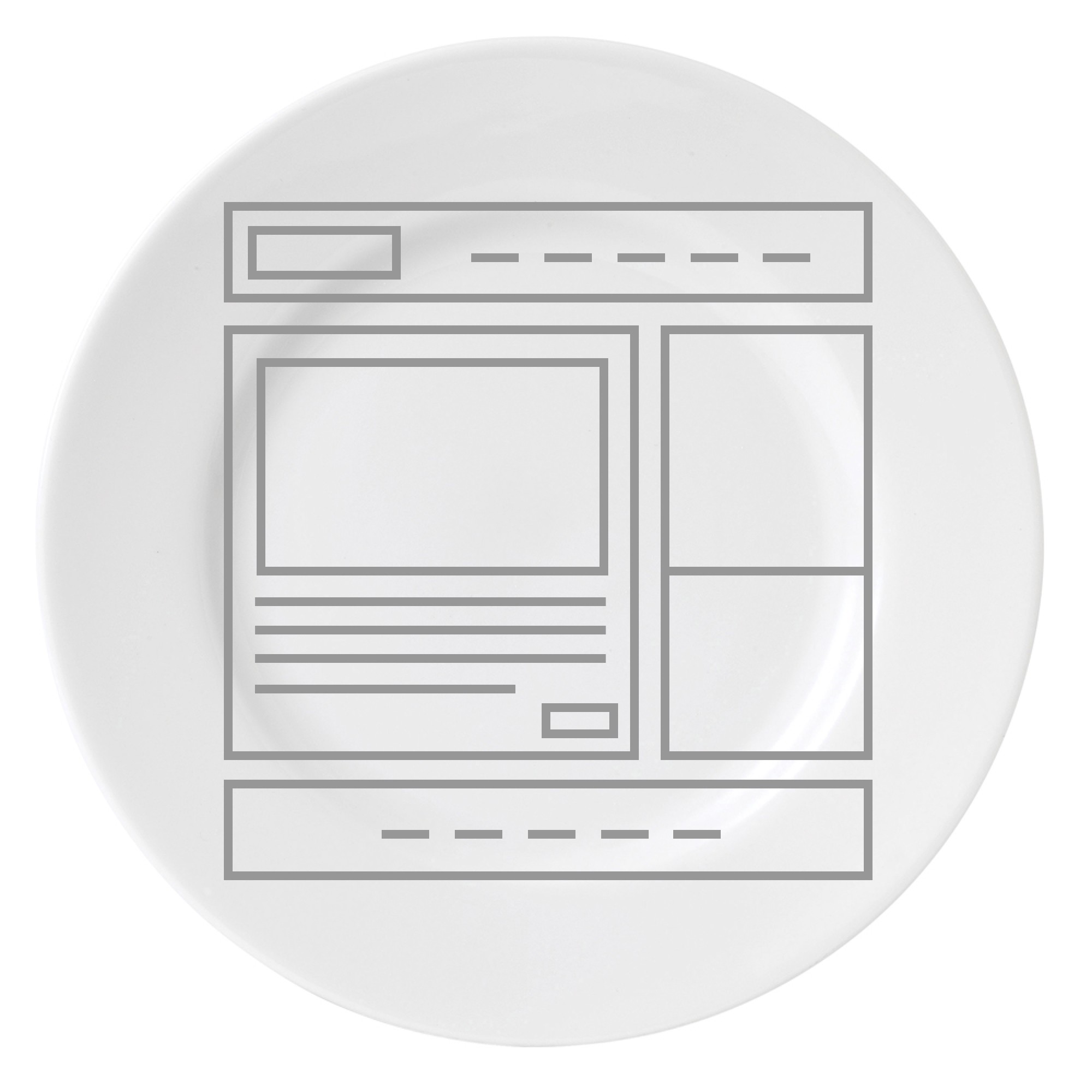
Consider comparing the restricted shape of a desktop, tablet, or even mobile screen to a dinner plate. How easy is it to digest your web page content?

You can scroll down to view more in a web page, and likewise you can always find a larger plate. But how large of a plate is a comfortable size for just one meal?

Page composition is an essential part of any design
As website trends give page design a backseat with a new focus on content, we look to classic examples of layout composition such as magazines, books, and print materials. Other than differences of dynamic web content, we should learn composition from the classics. Just because your medium is battery powered, doesn’t mean you don’t have a need to observe classic elements of design.
Here are some basic principles I found in this great article Mary Stribley, designschool.canva.com/blog/visual-design-composition
-
Find Your Focus
If everything is the focus, NOTHING is the focus.
-
Direct the Eye With Leading Lines
Busy or harsh content separations will stop your eye from successfully making it to the bottom.
-
Scale and Hierarchy
Literally step away from you monitor. Can you tell a hierarchy and make sense of your layout? DO THIS OFTEN.
-
Balance Out Your Elements
Like it or not, responsive grids dominate today’s layout. But it is possible to still create beautiful responsive experiences.
-
Use Elements That Complement Each Other
Avoid using plenty of harsh color or photo edges that create stiff separate sections. Your page may end up looking like a bunch of bars stacked upon each other and that’s hard to digest.
-
Boost (or Reduce) Your Contrast
Keep your type legible be using tasteful contrast. You can greatly effect the flow of your site using contrast.
-
Repeat Elements of Your Design
Use patterns to create familiarity in your experience. If every page is a unique design, it will take the user much longer to understand the format and digest the content.
-
Don’t Forget the White Space
White space is NOT “empty space”! Use it as a strategic tool to create balance, focus, and a clean digestible layout! Isn’t it appropriate to eat your food one bite at a time?
-
Align Your Elements
Make sense of arrangement while also being creative and innovative. Magazines are GREAT at this!
-
Divide Your Design Into Thirds
Use this magic formula to keep your eyes moving!
Make sure to think through ALL responsive breakpoints. Include a maximum breakpoint for large screens and TVs. Don’t rely on fluid to be your responsive solution every time! Start your designs in a mobile size first.
Now let’s take a look at a few portions…
I’m still hungry…
 dribbble.com/shots/3490949-Back-to-Basics-Part-1
Hey, that was tasty!
 apple.com/ipad-9.7
A complex dish, but it was balanced!
 geckoboard.com
I feel sick… ate too much…
 thanksgivingcoffee.com
I’m calling for backup! This could take a while…
 upstreamint.org

 Up next
Emerging Patterns for Designing in the GAI Gold Rush


