
UX Study: Hertz mobile app — Rental Customization
Current mobile app flow 🔍
For this study, I will be looking at the android mobile app version of the Hertz car rental customization process. For a full in-depth study, I would like to analyze the iOS version as well. The user journey is pretty quick and focuses on thinking about one thing at a time.
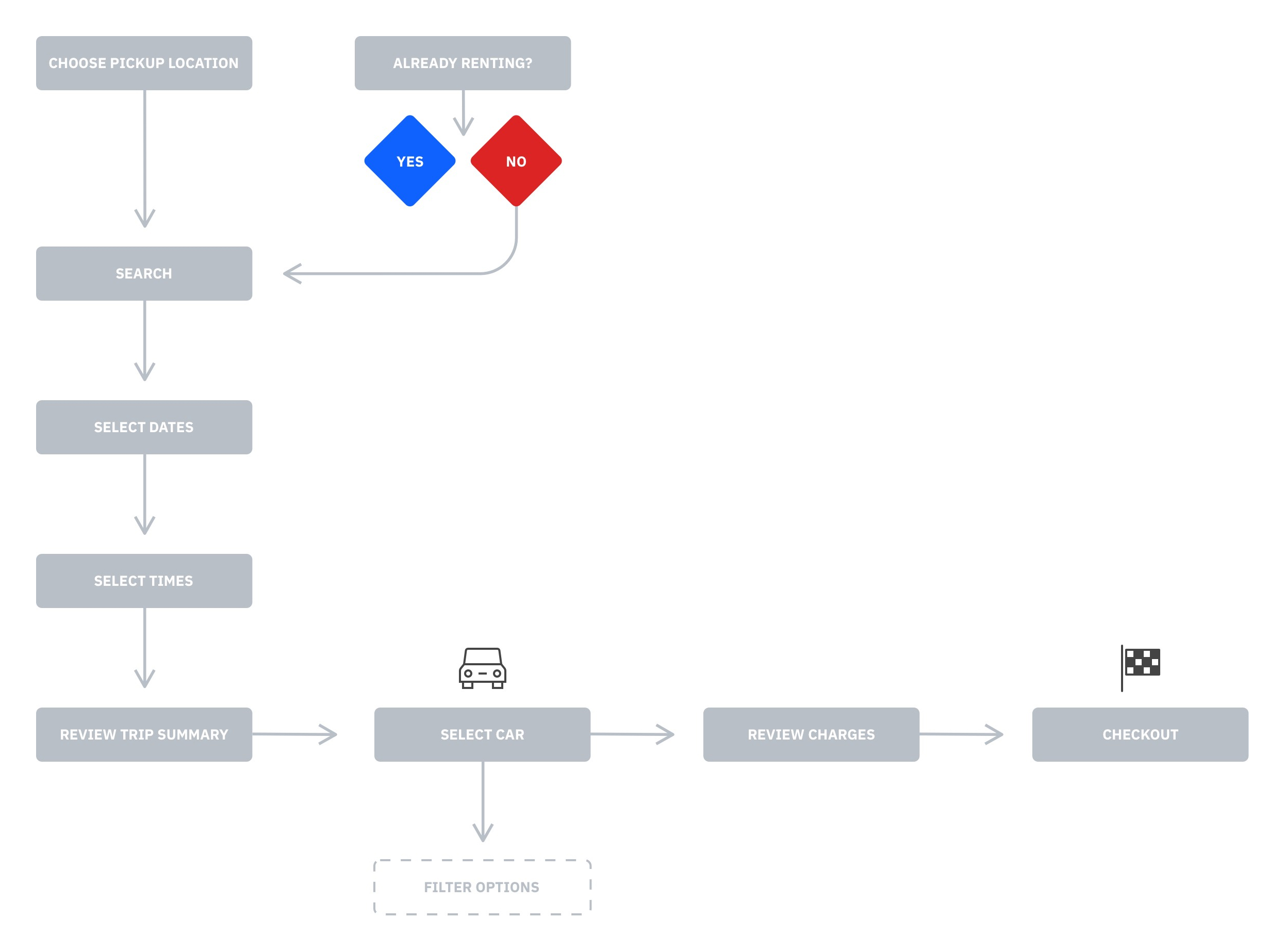 Roughly 10 screens and 9+ clicks/touches to finish. It’s pretty quick and focuses on thinking about one thing at a time.
Inventory of pages 📁
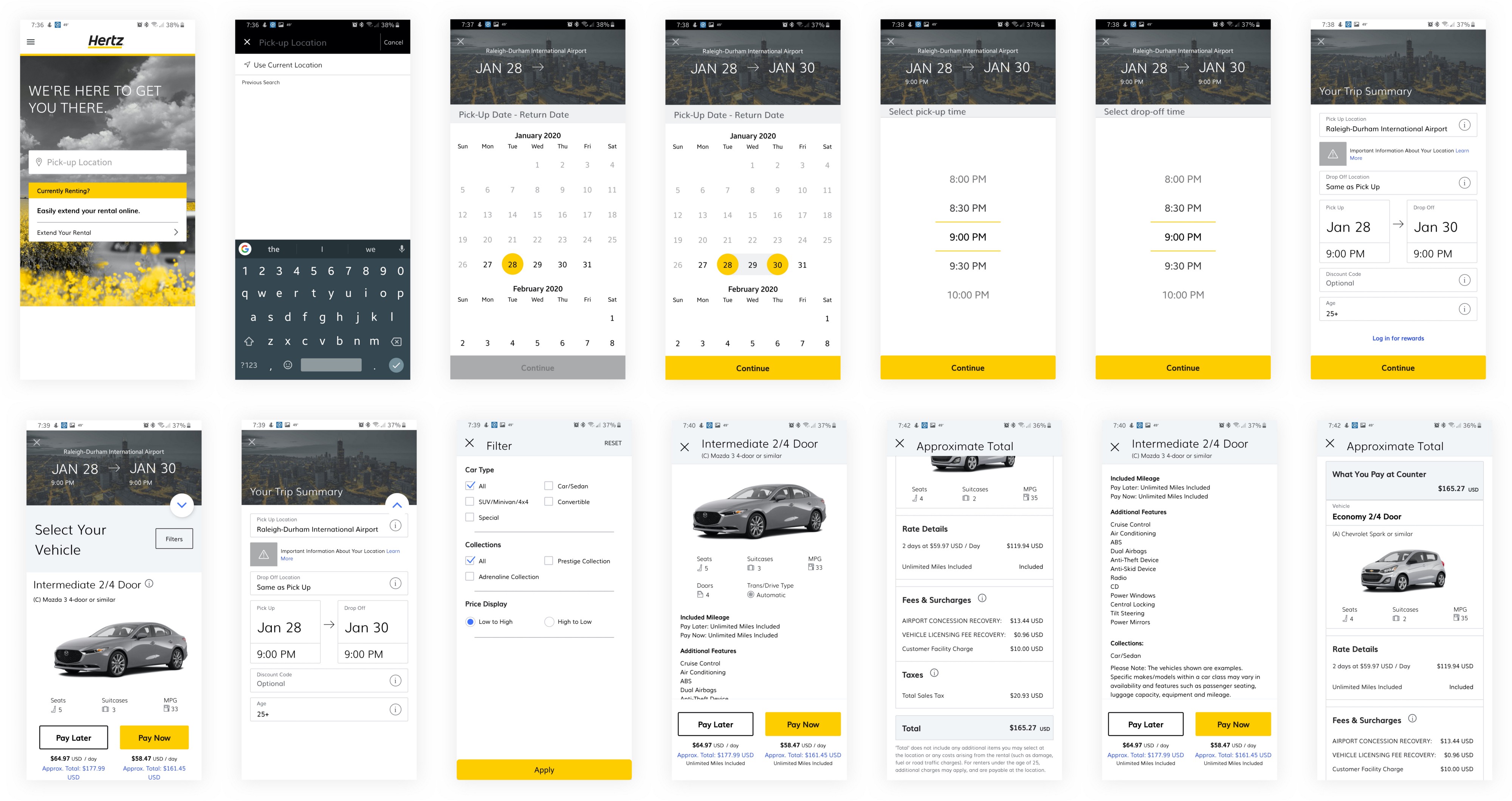 Roughly there are 10 major screens and 9+ clicks/touches to finish.
Persona interviews 📝
For this exercise, I am looking at a “mid-career professional”. I have to admit this is kind of vague. How can we better know this persona? Can Hertz request some promotional interviews with real users? In what ways is Hertz looking to market or sell to this specific persona? In what ways is this persona different than others?
Some interview questions could include,
“In what way are you utilizing your business rental? For simple personal transportation? Transporting your team? Transporting prospective clients?”
“How far are you typically traveling for business?”
“What feature do you most look for in a rental?”
“When traveling for your company, are you looking more for comforts or cost savings?”
“How do you feel when renting a car for work?”
“What frustrations do you feel when renting a car for business?”
App store reviews
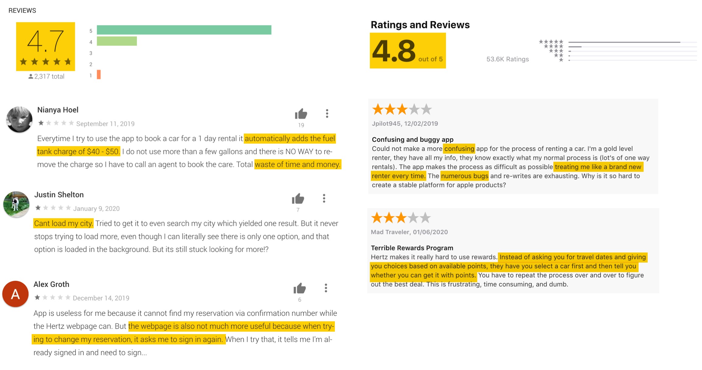
A quick and dirty way to get user feedback right now would be reading the iOS and Android app store reviews. Despite some technical snafus, people are really enjoying this app for both iOS and Android platforms. The app has nearly perfect ratings. It’s important not to fix something that’s not broken, but maybe we can find some ways to make it even better. Some of the reviews are asking for more convenience on returning customers.
Competitive Analysis 🎯
It’s not beneficial to reinvent the wheel. Let’s look at how other competitors have thought through some of the same flows.
Enterprise
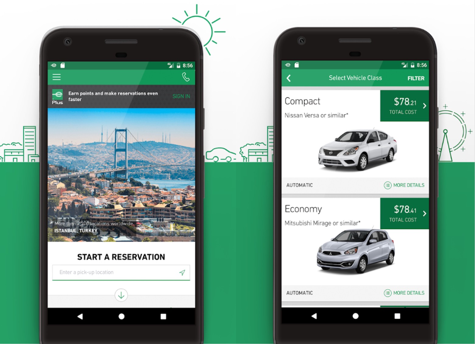 Enterprise has a very clear call to action and distinction between signing in and starting a new reservation. The car selection appears to focus most of all on cost.
Avis
 Avis has a clean list that focuses on seats, storage, doors, and driver-assist (at least I interpret that’s what the unlabeled icon represents.) So Avis seems to prioritize features and upgrades.
Turo
 Turo combines the location and travel dates into one step. This might be a more convenient flow!
RYDE
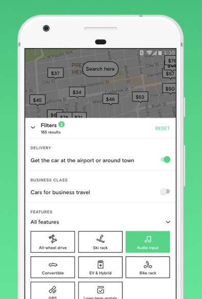 Ryde introduces some further customizations such as drive type, ski/bike racks, audio in (A must for a long trip!), GPS navigation, etc.
Defining the problem 🚩
In this exercise, let’s take a look at some of the difficulties a user could face using the current flow and UI designs.
Pain Point #1: Home screen calls to action aren’t clear 🧐
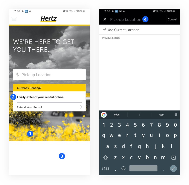
- The yellow branding in the background image is taking the same priority as the “Currently Renting?” action button. Pick-up Location is in a prominent part of the page but has little use of color to draw attention as a primary action.
- Is this line necessary? It adds extra reading/concentration
- This might be a development or marketing issue, but why is there a blank white space on the bottom? The page looks incomplete and a bit distracting.
- The “Pick-up Location” text input in the black header bar doesn’t appear very clickable. It looks more like a page header at the moment.
Pain Point #2: Date/time screens lack instruction 😶
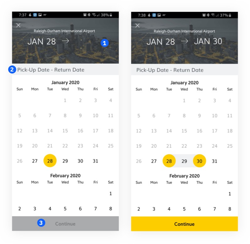
- While the photo in the background ads visual interest, the city in the photo does not match my destination. This could add misunderstanding.
- Instead of saying both actions “Pick-Up” and “Return” at the same time, we could dynamically instruct the one action you are taking at a time. First “Pick-Up”, choose a date, then “Return”, choose a date.
- There are no instructions on the page other than the heading. It could be difficult to know why I can’t click “Continue”. I might want to click “Continue” to select my return date.
Pain Point #3: Unclear UI changes and rewards login 😰
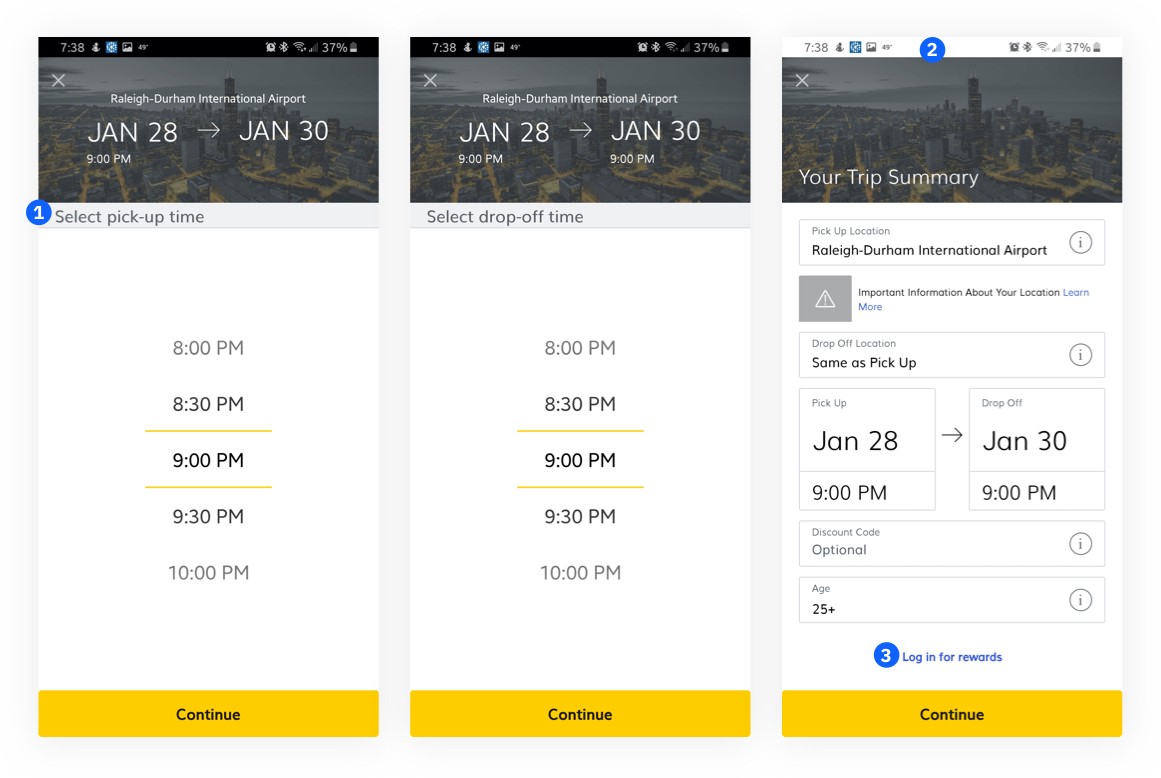
- We could really add some more prominence to this instruction.
- Why did the status bar change to white all of a sudden?
- Either this is a new feature, or the reviewer may have missed this link to log in. It could be given a bit more emphasis or added on the same line as “Continue”.
Pain Point #4: Trip summary action not clear 👉
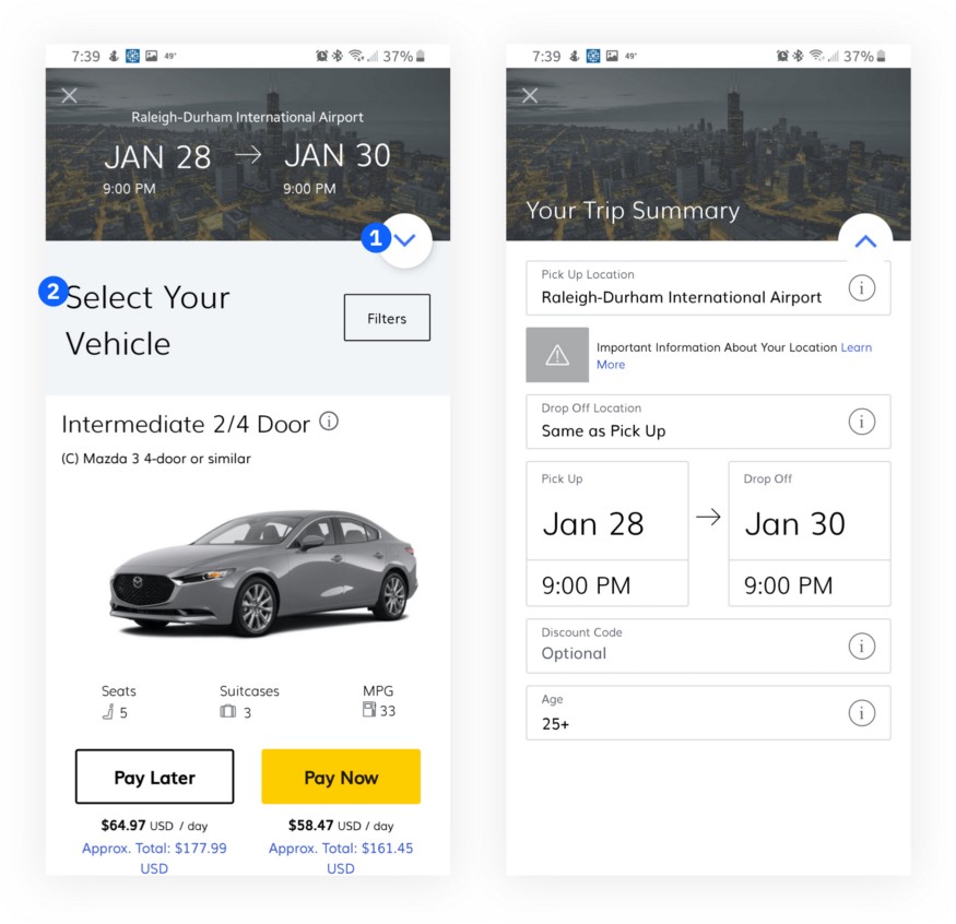
- It is entirely unclear what this arrow does. It looks like it resembles an android FAB, but we need better placement or cue to know what it will do. I discovered by clicking it I could edit my summary. I tried a few times beforehand to click on the summary itself to edit, but it was read-only.
- All right! Nice big instructions here.
Pain Point #5: Not enough customization for filtering results 🖍
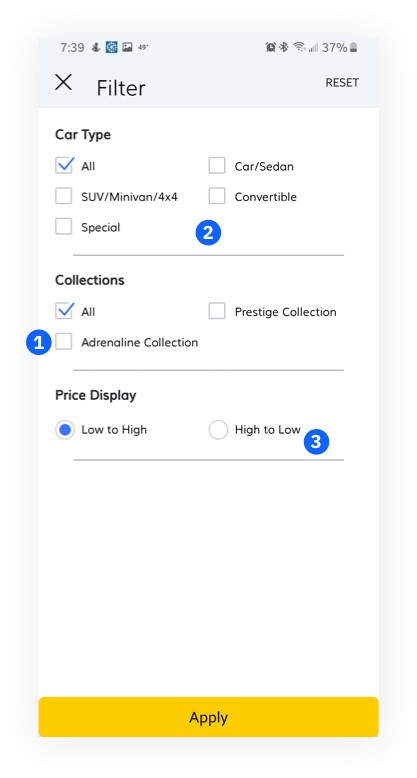
- For what other motives are our personas looking to rent a car? Is our mid-career professional looking to spice up his routine travels? The “Adrenaline Collection” is a great start. Is he looking to save his company rental and gas costs? An “Economy” collection would help. Perhaps “Luxury” if he/she is looking to make a great impression with clientele or “high capacity” if transporting part of their team to a meeting.
- Can I rent based on fuel efficiency or rent electric?
- Can I sort by safety rating?
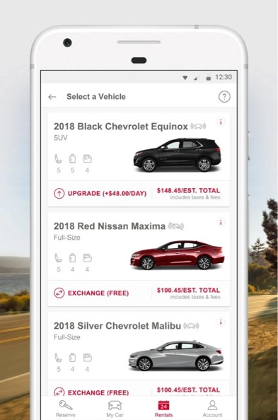
Pain Point #6: Poor organization on car details 📐
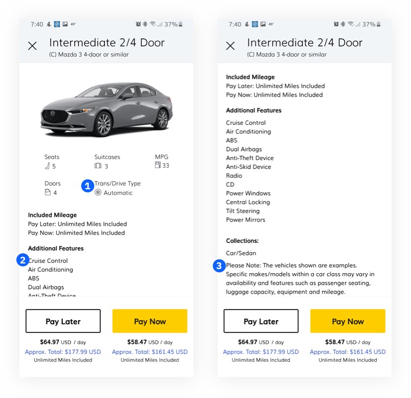
- Can we use the 80/20 rule to assume there are less than 20% manual cars available? If that’s the case, we could remove it unless the car is manual? Maybe we could then bump up the options to one row and give more room for the additional features.
- If we split this list into two columns, we could visually see more of the options. Only four are visible on this large device before getting cut off.
- This note seems pretty important. It may need some sort of different UI treatment to show its priority.
Ideating Solutions 💡
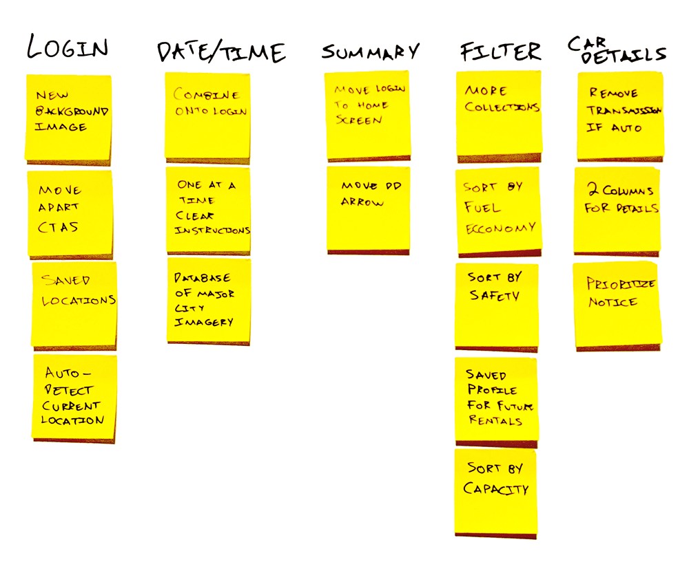 Afinity map
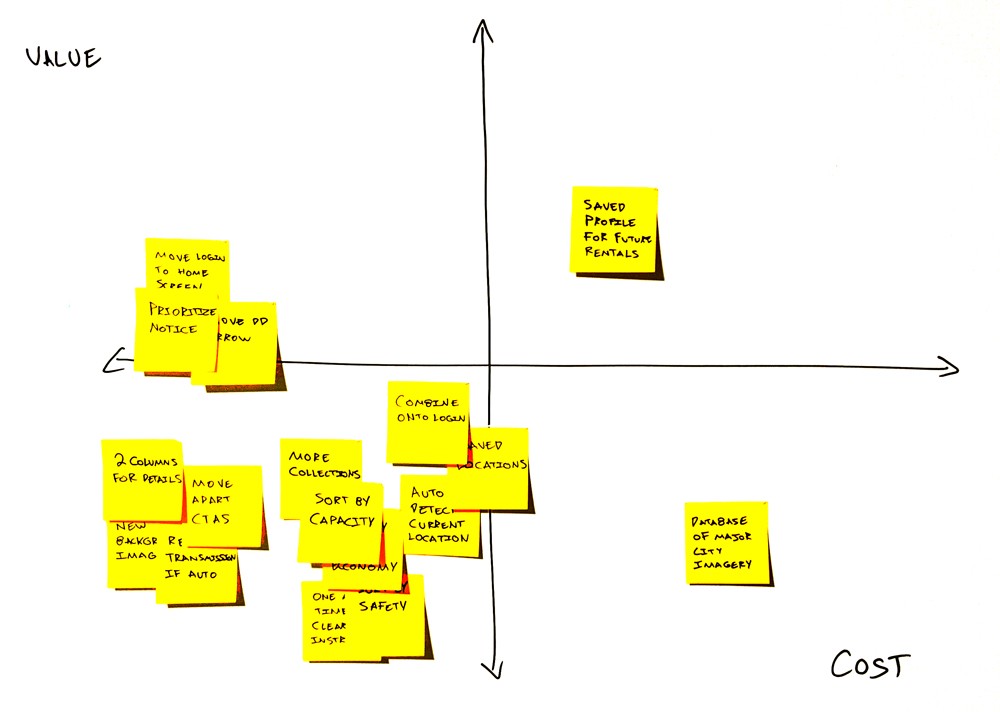 Cost Value Matrix
Reviewing the interview data, competitive analysis, and pain points, it’s finally time to ideate. I used an affinity diagram to start coming up with possible solutions. Even if they aren’t great ideas or contradict each other, it’s good to get them out and on the list.
Wireframes 🔖
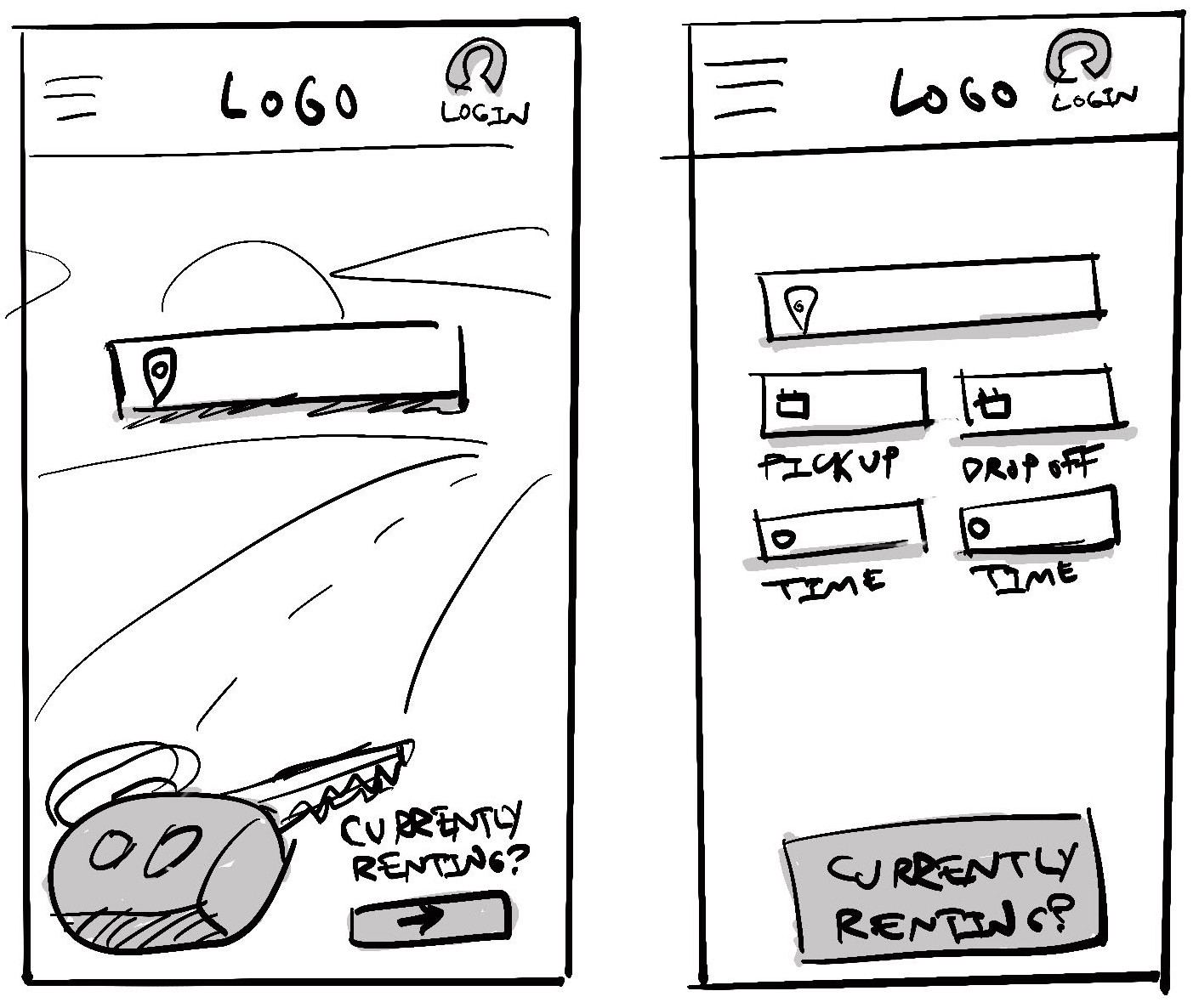 Here I’ve sketched out some home screen possibilities.
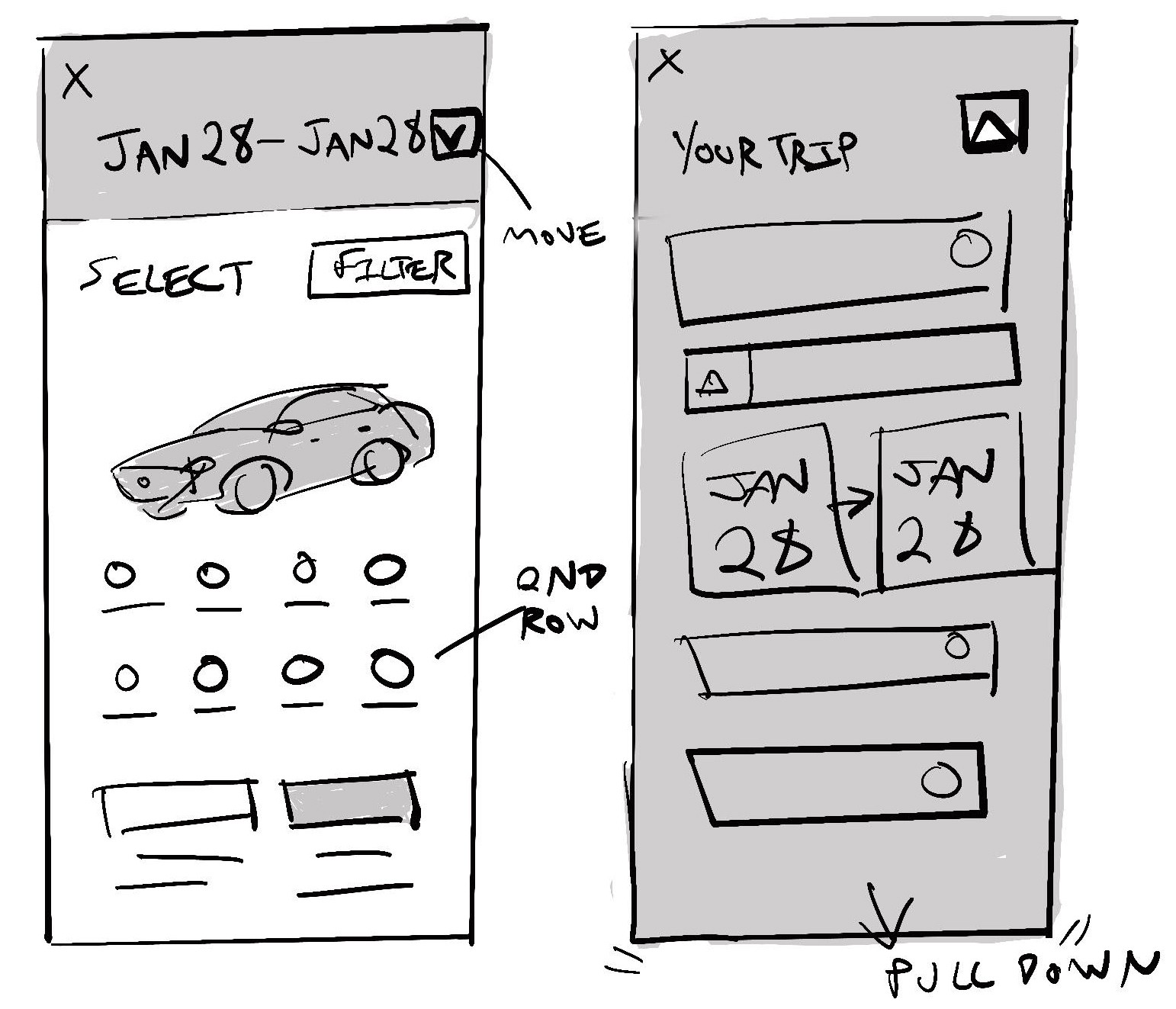 I took a bit to play with the layout of the car detail page as well as the dropdown on the trip summary
Prototype 🎨
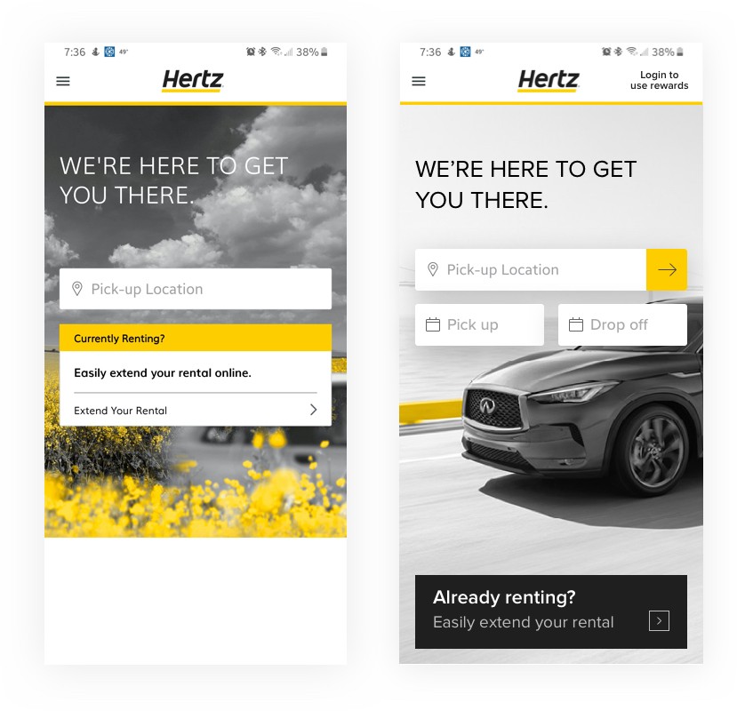 Our new home screen addresses visual hierarchy issues and combines the next two booking steps entirely.
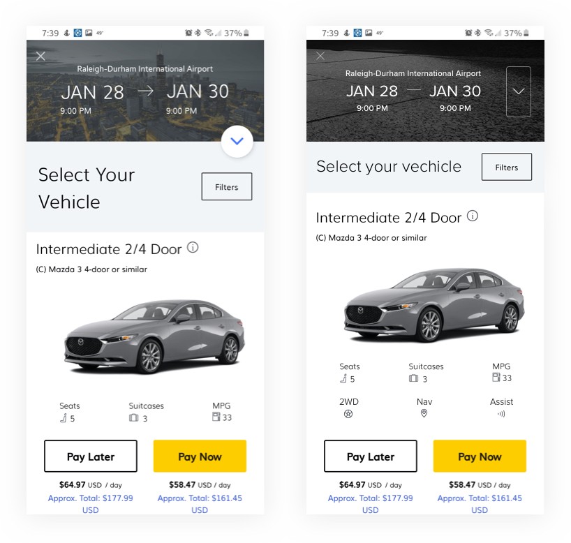 On the details screen, we’ve addressed the summary dropdown issues which gave us room for another row of informative feature icons.
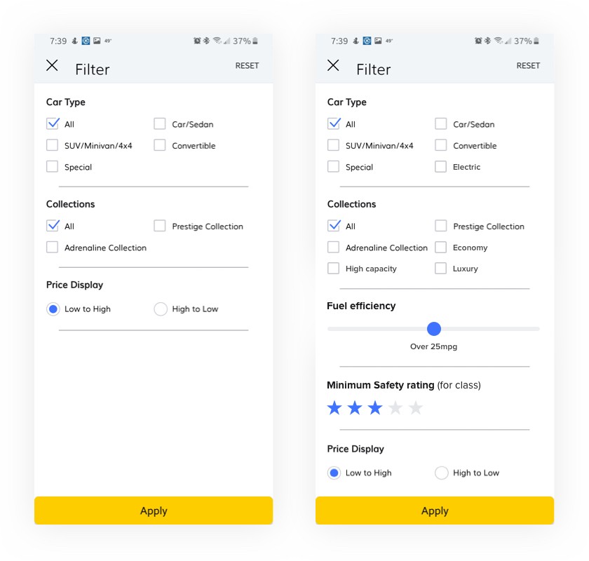 Listening to our personas feedback would heavily drive the filter options.
Test Wireframes and iterate based on feedback 👪
At this point, it would be great to get feedback on the prototype using a beta group of users. Short interviews with frequent or top users would provide feedback. We could also use analytics to see which filters are being used and also measuring how has the volume of support calls changed any.
Conclusion 📓
The Hertz app is already a really good app. It’s so close to being great! With a few UX/UI improvements, we could reduce friction and help users find the vehicle they are looking for. I still think there is room to think for returning customers and building out preference profiles. That is a bigger cost for the development team, but could greatly boost brand loyalty to frequent users and businesses.
 Up next
UX Study: Bank of America Credit Card — Payment Flow
Up next
UX Study: Bank of America Credit Card — Payment Flow


