

UX Study: Bank of America Credit Card — Payment Flow
Current web app analysis 🔍
For this study, I will only be looking at the web version of the product. For a full in-depth study, I would need to analyze the mobile web and the native app. As a current customer, I know that these experiences are not one-to-one.
Payment Flow
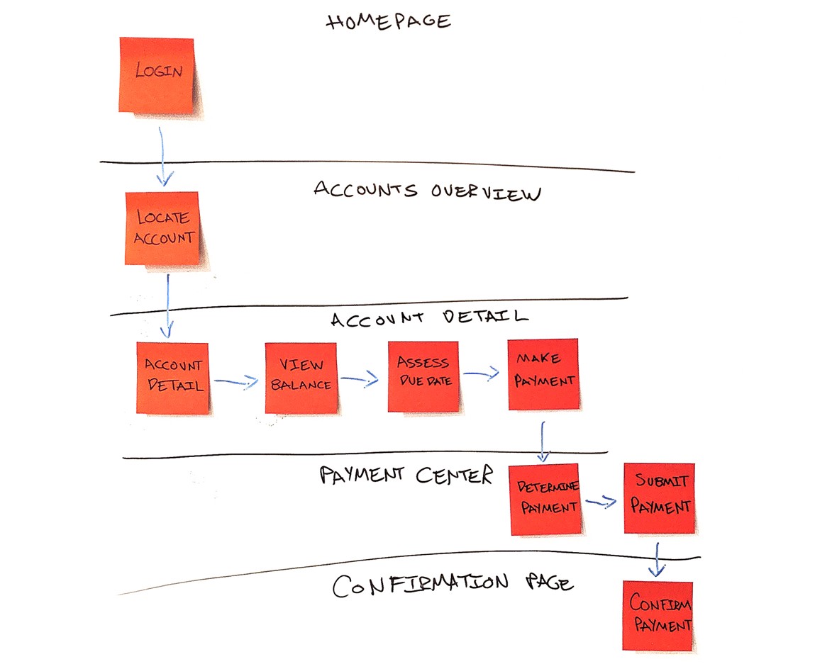 From login to confirmation the current flow takes ~ 8 clicks to make a payment.
Inventory of pages
 Today there are roughly 5 pages needed to make a payment: Login, Accounts Overview, Account Detail, Payment Center, and a Confirmation page.
Persona interviews 📝
After analyzing the product, this would be a great time to host persona interviews. Personas would be identified with the help of stakeholder's knowledge and analytical user data. I’m assuming information like age, location, products, and even economic brackets could be determined from signup and account data.
Some interview questions could include,
“In what way are you utilizing your business rental? For simple personal transportation? Transporting your team? Transporting prospective clients?”
“How many other B.O.A. services do you own?”
”When do you like to pay off your credit card?”
“How often do you like to pay off your credit card?”
”What device do you usually use to make payments?”
“Have you had any difficulties making a payment?”
“When and how often do you check your credit card balance?”
“Have you ever missed a payment? How does that make you feel when you miss? Is it typically your blame as to when you miss a payment?”
“Do you currently know your next statement due date?”
“How does it feel to avoid interest payments?”
Competitive Analysis 🎯
Ideally, I’d like to compare apples to apples, but I only have access to one credit card web portal. I was forced to check out mobile apps for inspiration.
Apple card
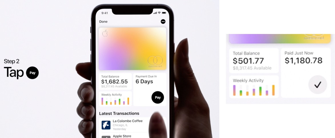 Apple Card has a very minimal and intuitive experience. No distracting marketing here!
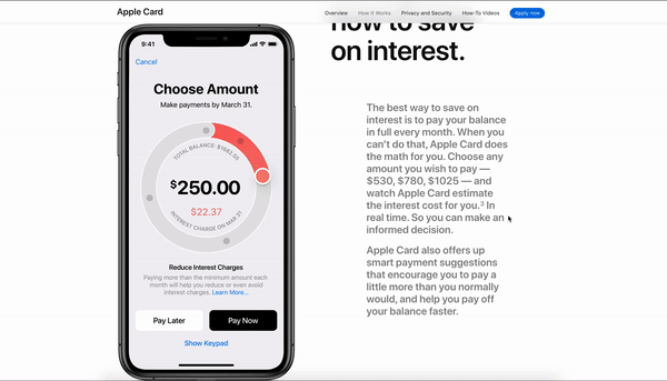 Interactive charts serve as an input field and show you exactly the effect of your payment. Also, what a FUN way to enter a payment amount!
PNC Virtual Wallet
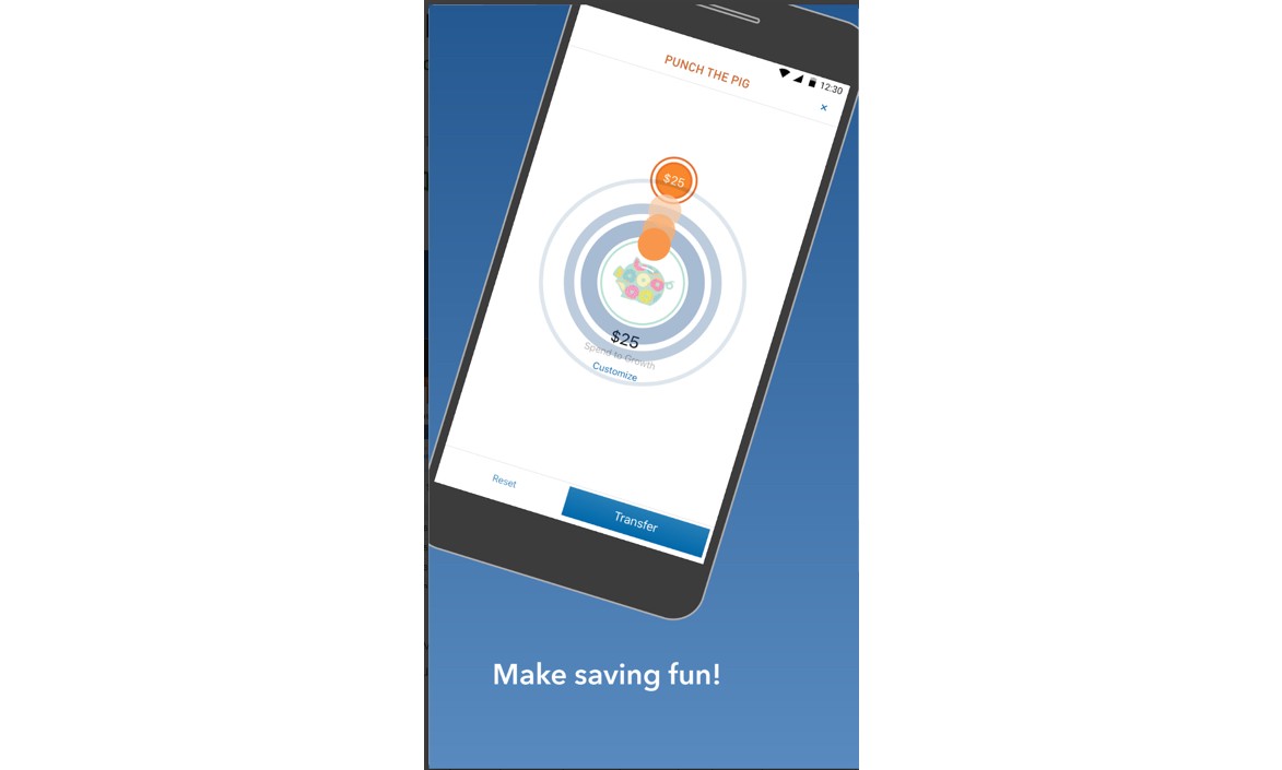 PNC sees the motive of saving and adds delight. Paying off a credit card is a reason to celebrate!
Petal
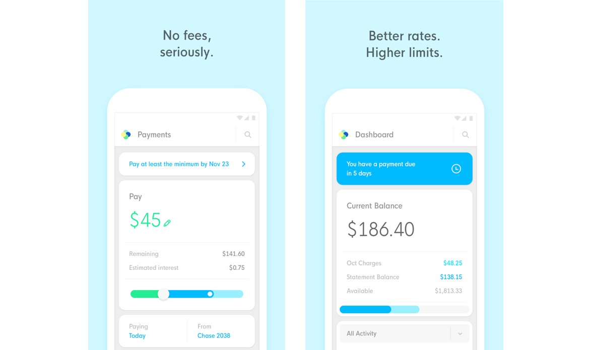 Petal does an outstanding job of visual hierarchy and demonstrating the priority of making payments.
CitiBank
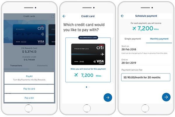 CitiBank shows you how your payment affects your reward points. A great user motive to using and paying off your credit card. If I know using my card is positively increasing my points, I’m encouraged to use it even more!
Defining the problem 🚩
For the sake of this exercise, I’ll use myself as a sample persona (since I am actually a user) to discover some pain points. Using multiple persona’s interview data you could see overlapping similarities and evaluate critical pain points and repeated friction.
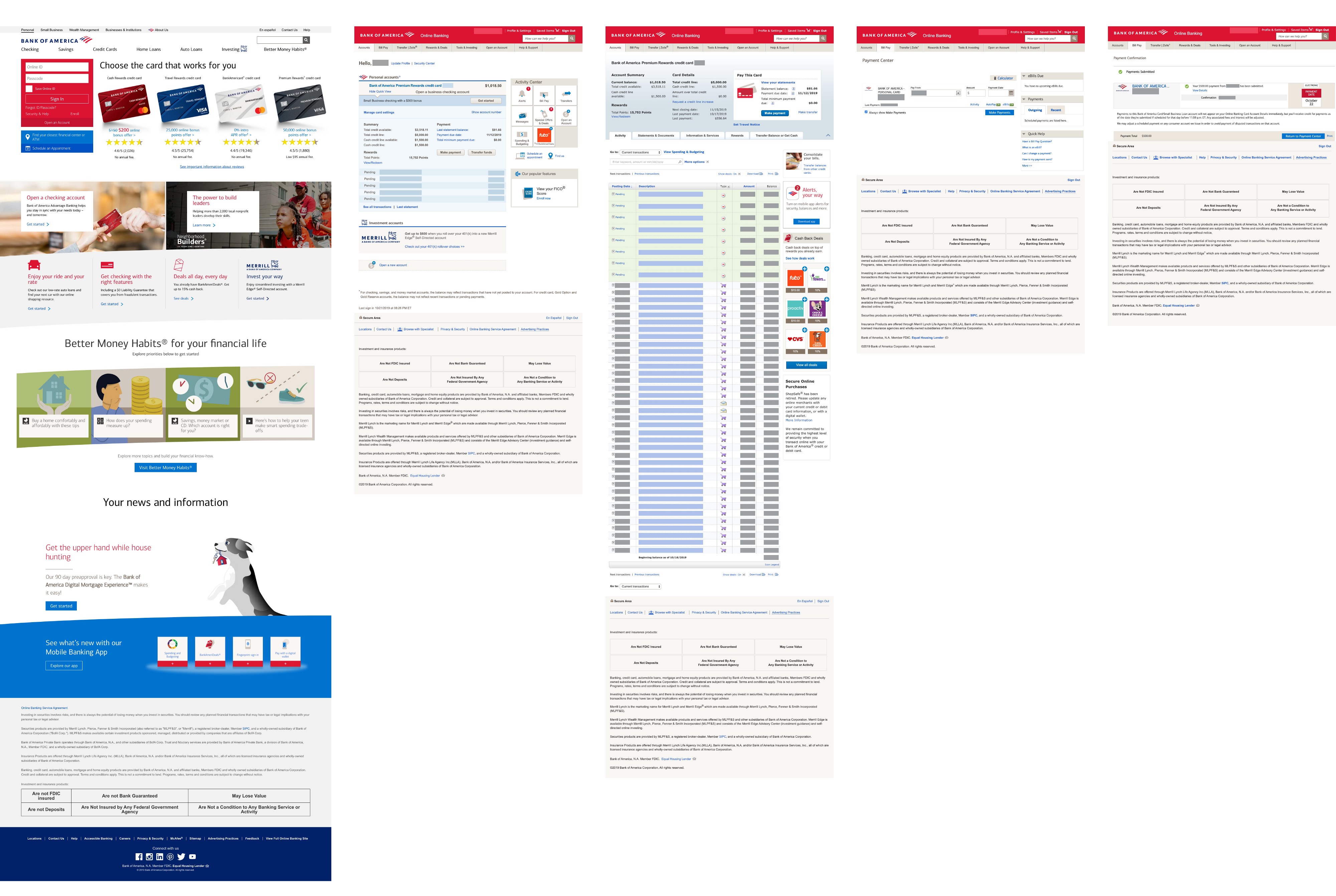
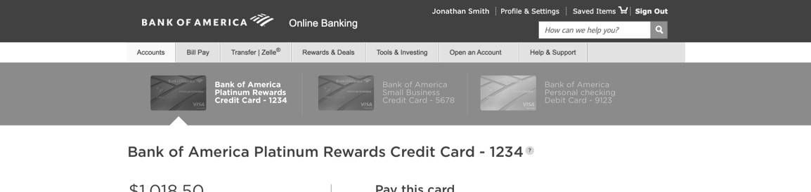
Pain Point #1: Pages are cluttered and difficult to navigate 😵
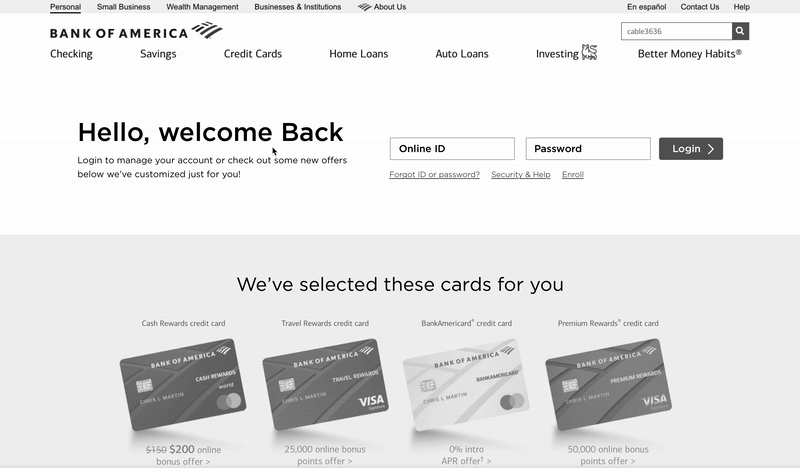
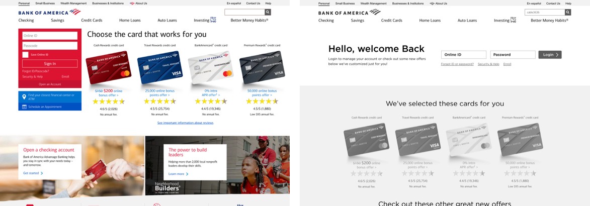
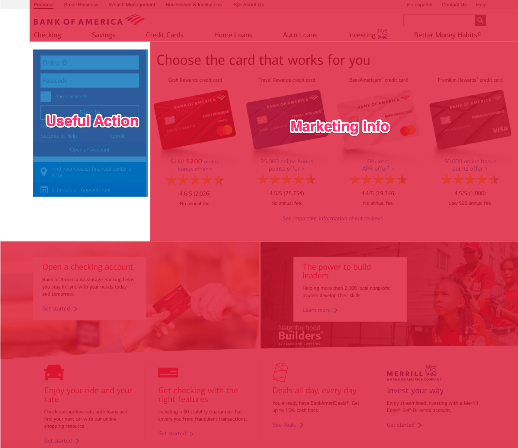 90% of the login page is dedicated to strongly colored marketing that minimizes the need of the user, which very well could be urgent. A bank user can have much more urgency than say a customer on a clothing store.
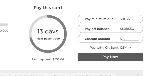
Pain Point #2: Critical payment information does not stand out and is confusing at a glance 📅
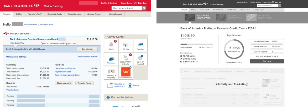
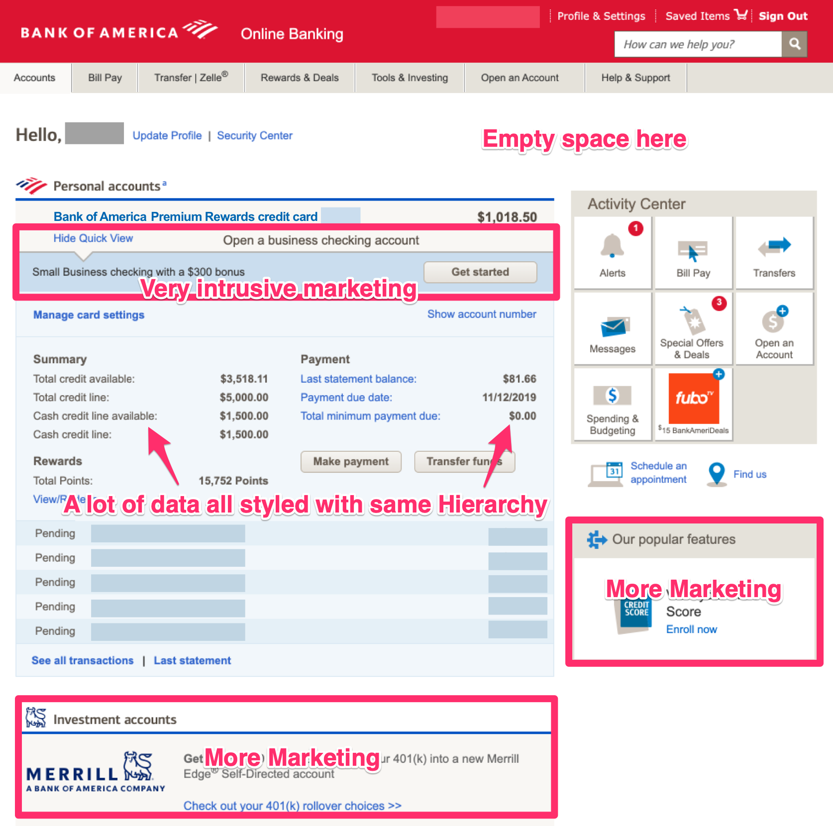 The information has no sense of hierarchy. We are forced to sort out the mess and spend a lot of time hunting for the right information. Marketing is still everywhere and is very intrusive.
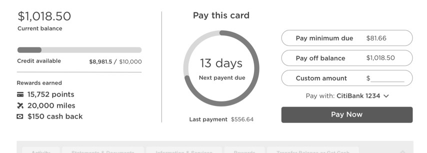
Paint Point #3: Account Overview and Account Detail have redundant information 😩
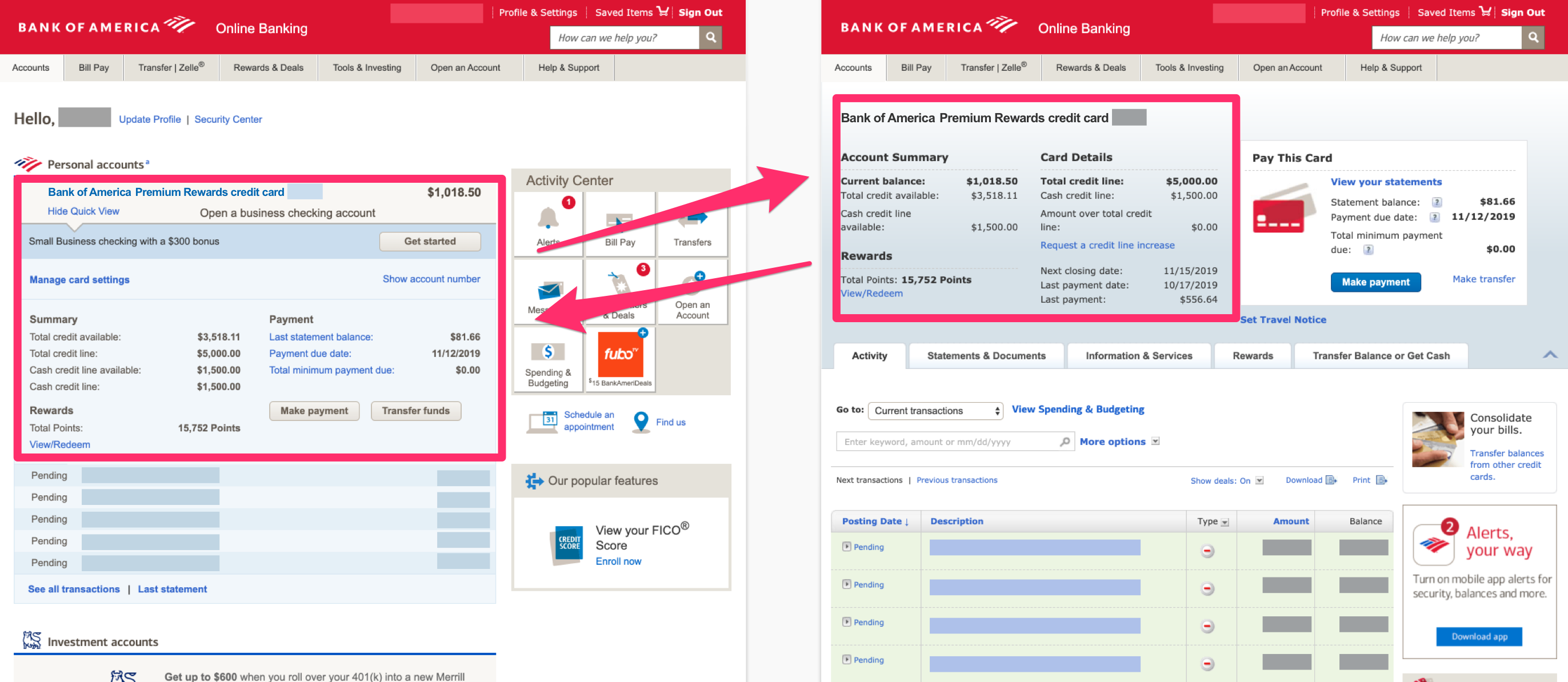 We are seeing VERY similar information, but styled and organized slightly different. We have to play a spot the difference game. If I only have one account, which I do, what benefit does a list bring anyways? Shouldn’t the flow skip the list and go straight to my one and only account?
Pain Point #4: Payment call-to-action is not always clear 👉
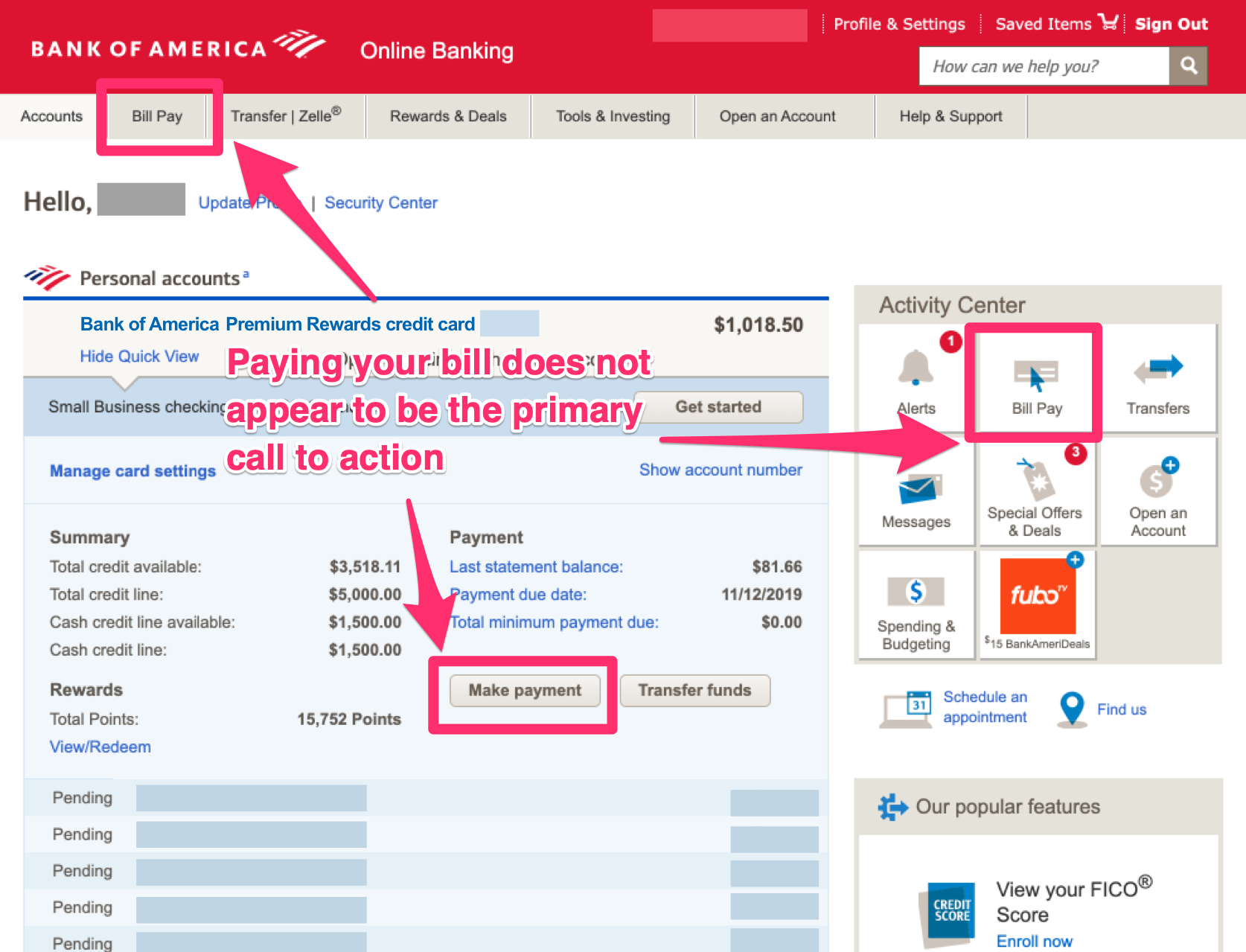 The terminology for “Bill Pay” in banking could mean scheduling bills to say a utility. It does not focus on a verb enticing the user to take action. The “Make a payment” button is not really near the balance and is styled in a secondary grey color.
Pain Point #5: In the Payment Center, you can’t view your current balance in order to pay off in full 🙈
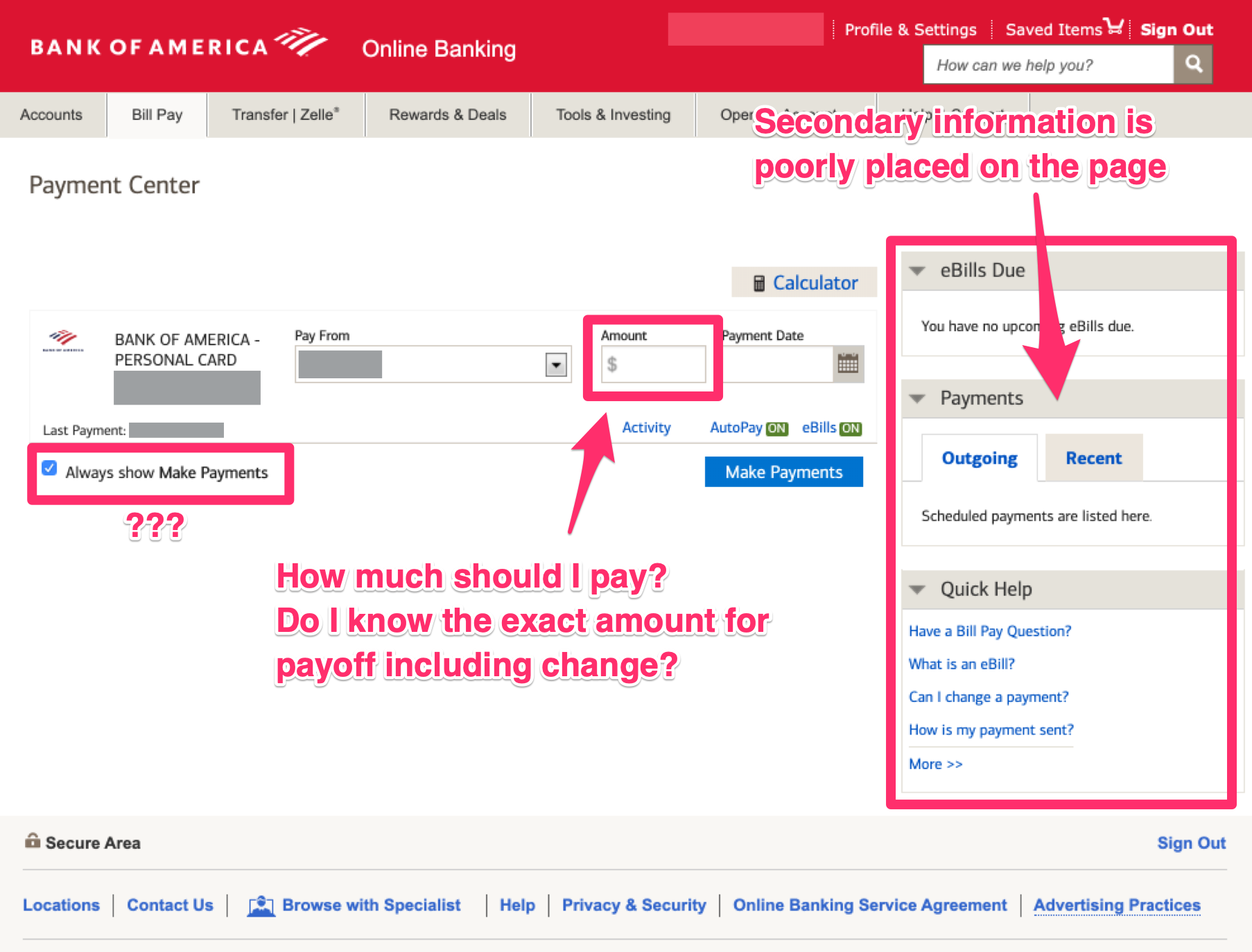 This has been the most frustrating bit of friction for me as a user. It requires me to go back to the previous page, copy the exact amount, them come back to this page and paste in the remaining balance.
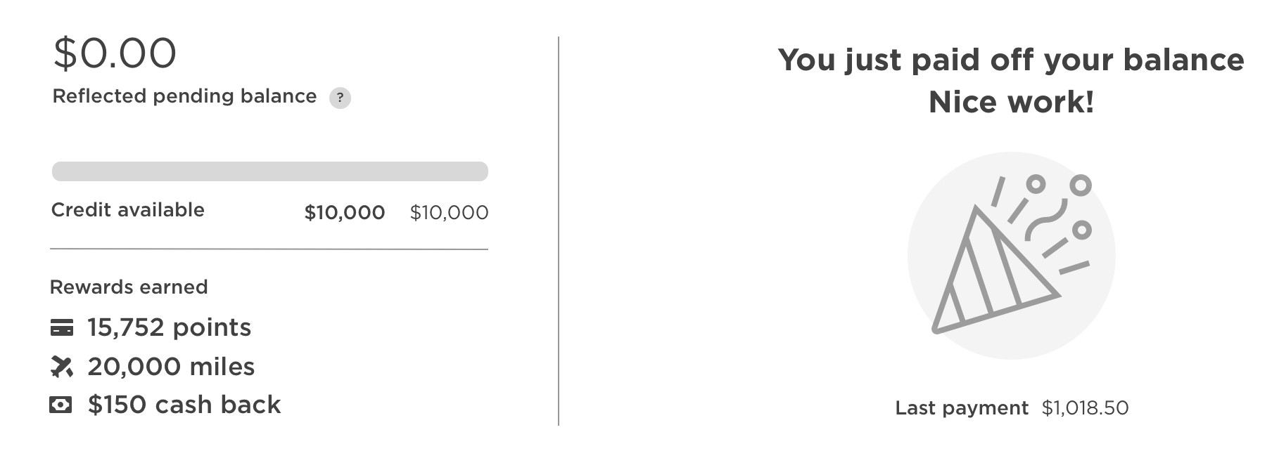
Pain Point #6: After making a payment and going back to Account overview, the outgoing payment is not reflected at all 🚫
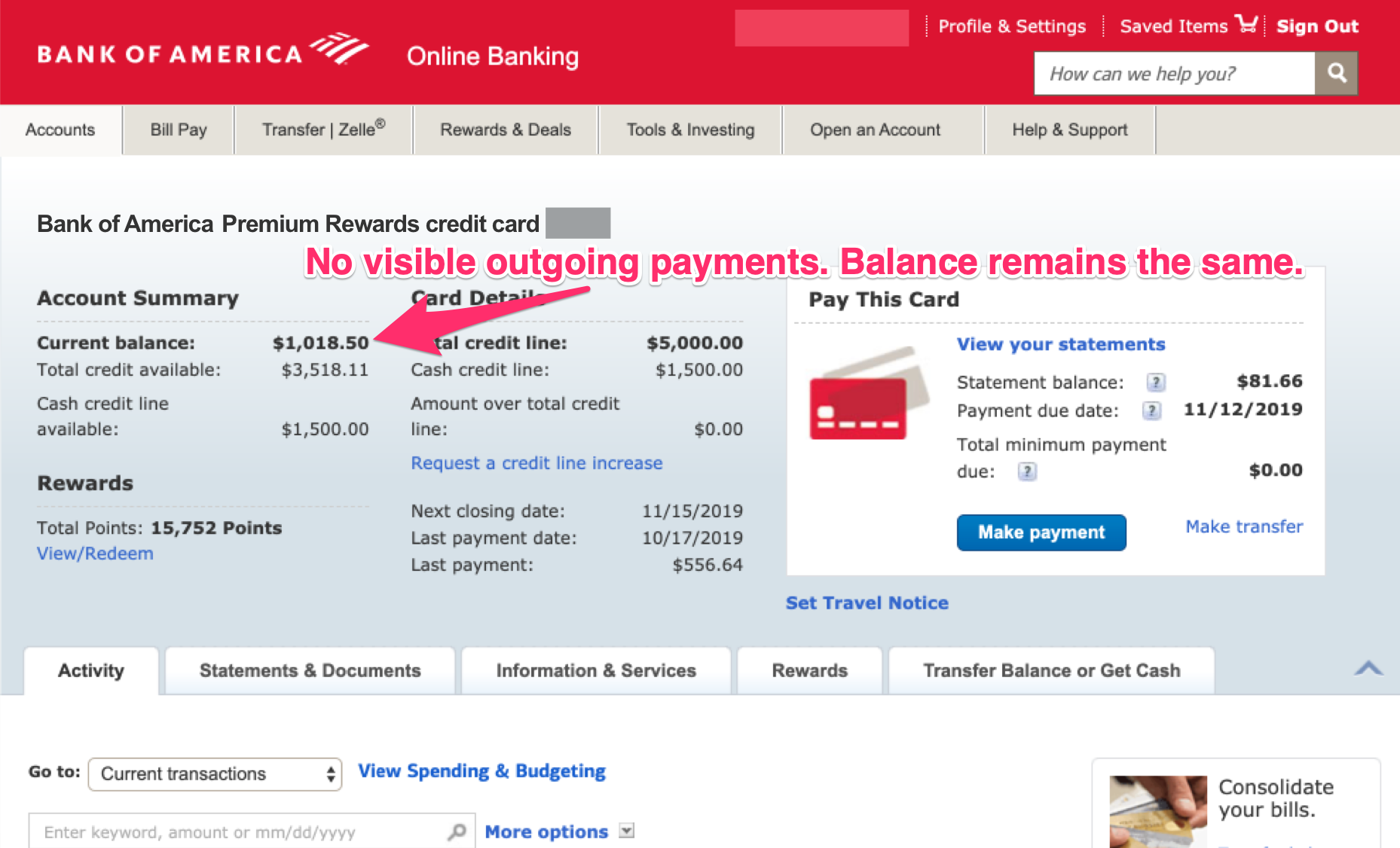 If the balance remains the same after making a payment, you could easily make the mistake of thinking the payment didn’t go through and possibly try again. Users need to know there is a pending payment one way or another on this screen. This could result in some overpaying a balance, possibly in a large amount!
Ideating Solutions 💡
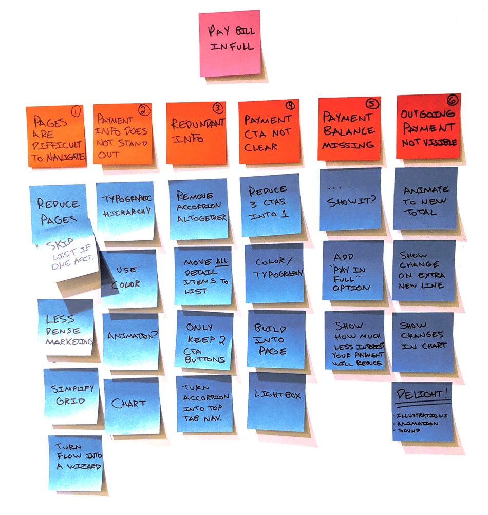
Reviewing the interview data, competitive analysis, and pain points, it’s finally time to ideate. I used an affinity diagram to start coming up with possible solutions. Even if they aren’t great ideas or contradict each other, it’s good to get them out and on the list.
New User flow ✨
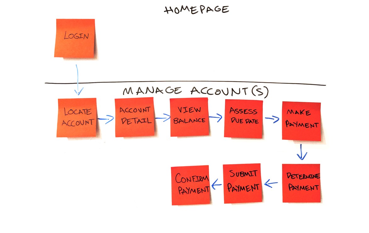 To reduce clicks/load time and keep all contextual data visible, I plan to simplify the process down to two basic screens reducing down to ~4 screens.
Wireframes 🔖
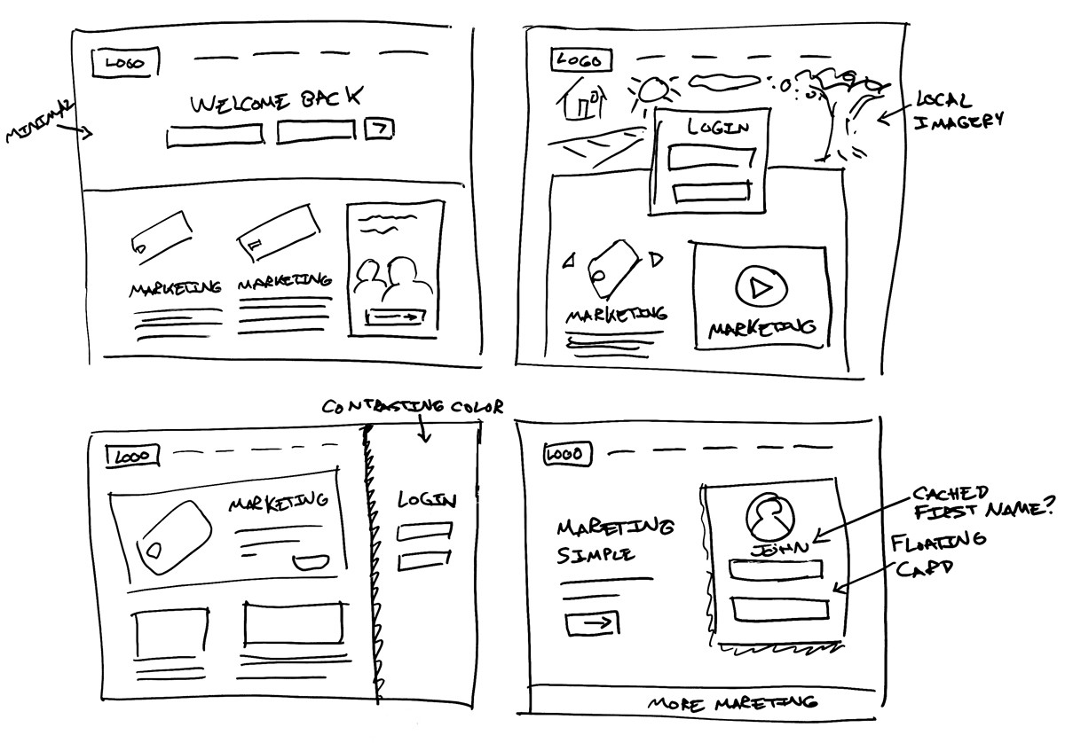 Here I sketched out on a whiteboard some possible simplified login layouts.
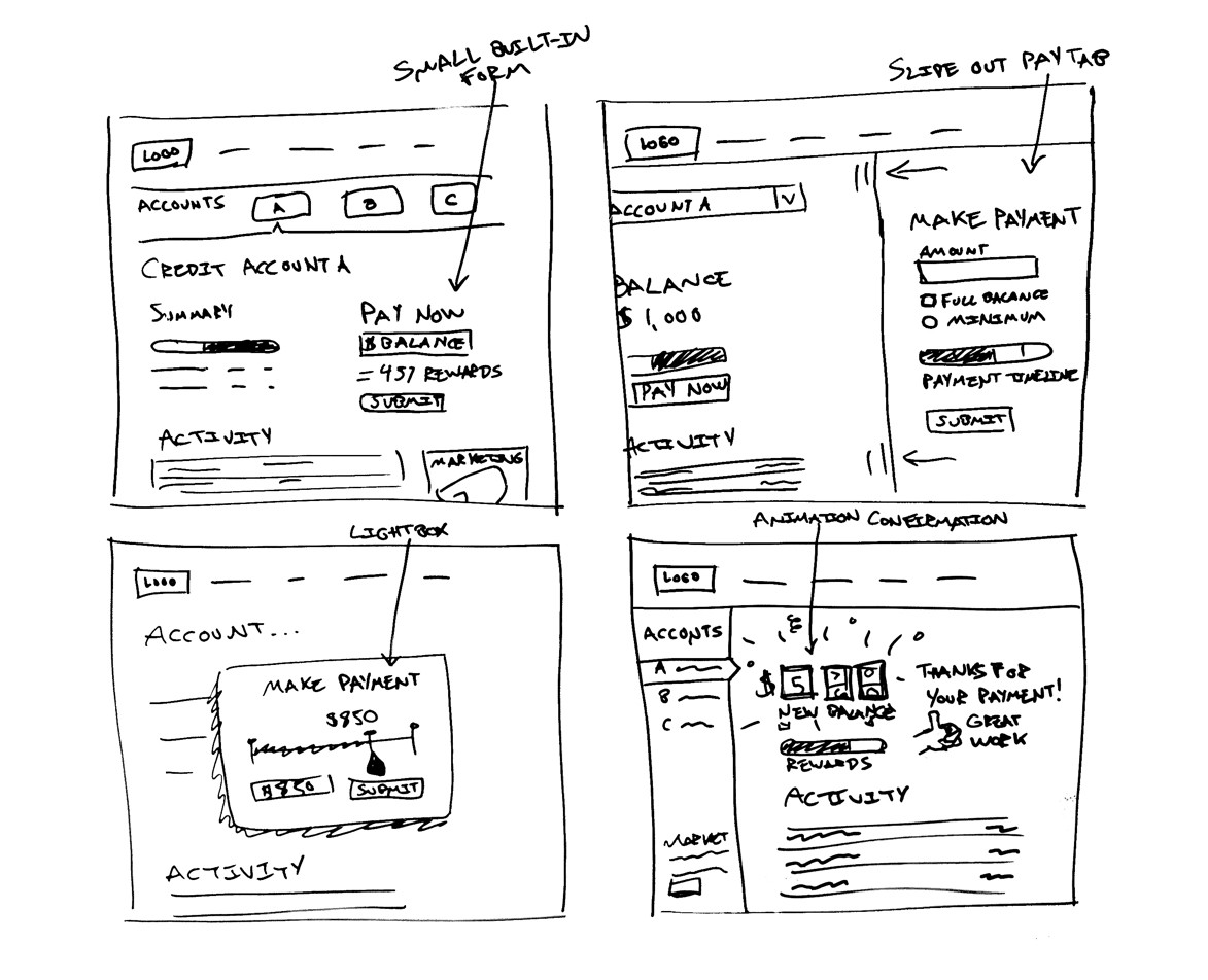 Next, I sketched out some aspects of the all in one page Manage Account screen.
Prototype 💻
Above is a 30-second preview of my interactive prototype. The prototype is using a mid-fidelity wireframe based on the whiteboard sketches.
You can view the live InVision prototype here, https://invis.io/XGUJPMS7TEB#/390417640_Manage_Accounts_5
Addressing pain point #1 ✅
The login screen had a lot of marketing clutter. Using very similar screen real estate and a horizontal pushed down layout, we can create a much clearer call to action.
Addressing pain point #2 ✅
Creating visual hierarchy and thinking through a user’s flow made transformed this hide and seek table into a fun interactive experience.
Addressing pain point #3 ✅
Creating a slimmer always visible account drawer reduced an entire page that had redundant information. Now, I’m assuming the average user only has ~3 accounts. For users with many accounts, we might need to create a text list or drop down, etc. when you reach a certain threshold.
Addressing pain point #4 ✅
By giving payment so much real estate on the screen, we are making this common task top level. There are no extra clicks or screens to begin the payment process.
Addressing pain point #5 ✅
We solved this issue with multiple solutions. You can view your balance on the left because you are not leaving the screen, and the balance is repeated in a “pay in full” button for convenience.
Addressing pain point #6 ✅
Paying off balances are no longer a mystery. They are now celebrated with fun illustrations and tone. The balance is reduced in real-time with a note that this balance is “Reflected pending”.
Test Wireframes and iterate based on feedback 👪
At this point, it would be great to get feedback on the prototype from actual users. Taking that feedback, I could make changes and improve flow or layout to make an even better experience.
Conclusion 📓
There are still many questions to consider for this concept,
- How will this new layout effect marketing sales? Will the new simplified experience offset the lack of advertisement success?
- Are there other high priorities other than paying off a credit card we have neglected?
- This is a drastic change for a commonly used flow. Can will we accommodate the new rollout gradually?
- Is BOA intentionally adding friction to paying off my balance? Are there dark patterns at work here to keep me from paying my balance and using my rewards?
Some ideas to test the impact of this new payment flow
- There should hopefully be a change in global reduction of late payments
- Speed of transactions on the account should be increased
- Track which method customers are choosing to pay their balance. Does it have any effect on their previous behaviors?
- Is there a reduction in customer service calls for this page?
- More customers paying off their debt and avoiding interest should create a much more positive NPS?
 Up next
Enduring Web Designs
Up next
Enduring Web Designs
Say Hi
Socialize


